Using the Rules of Typography to Improve Your Designs
Learn how to improve your typography design to communicate the right message through type, fonts, and the core elements of visual communication.


Understanding type, fonts, and visual communication
Good typography get easier once you know the rules and great typography takes practice. Designers probably here this all the time... "There’s nothing to it… Open a drop down menu, select a font that you think will work and type away, right?!"
It’s easy to think that because of all the tools and resources we have access to today. There is much more to understanding typography than we realize. I used to know nothing about it, so don’t feel like you’re alone.
Don’t you worry though. I’m here to share everything I’ve learned in bite-sized chunks so that you can make better creative decisions when you work with type on any project.
What is typography?
Typography is the art or procedure of arranging type. Every font and character arrangement plays a crucial part in how a message or brand is conveyed. Everywhere you look there is typography and it’s our job as designers to learn how to properly use typography to communicate the right message.
All of the elements we walk through in this article apply to both graphic designers and product designers. Whether you're crafting something for print or to be used in an application, these guidelines will help you grow.
Let’s start with the basics: typeface vs. font
Originally, the typeface is a particular design of type, while a font is a type in a particular size and weight. In short, a typeface usually gathers many fonts. You’ll hear these terms used interchangeable now a days, but if want to sound smart, you should know the difference.
Font
A font is a type in a particular size and weight.
Typeface
A typeface is a set fonts.
Anatomy of a typeface
Learning the anatomy will not only help you decide the appropriate use of fonts but it will help you communicate with other designers and ensure that everyone is on the same page. Below are the typography terms that will help you describe different parts of a typeface. Interested in type design? Check out Font Engineering.

Choosing the right fonts
Not sure where to start? Typically the best place to start is by finding your main typeface or what you will be using for body text since that is what takes up the majority of your real estate. This is often referred to as your anchor typeface. This is important since it sets the tone and acts as a reference point for all other elements in your composition.
It’s important then to find additional typefaces that complement the anchor. There are a couple of really great resources that offer filters to search for fonts by weight, width, x-height, etc.
Font resources:
Looking for free fonts? There are a lot available to you, but make sure you check the licensing on them before you add them to a project. Great fonts are worth paying for.
Be sure to check them all out and learn which resources work best for you and your flow.
Pairing fonts: finding fonts that work well together
When done right, different fonts can really complement each other, create visual hierarchy and help elevate your brand and the message your are communicating. And just like most things, there are rules to keep in mind in order to choose fonts that complement each other.
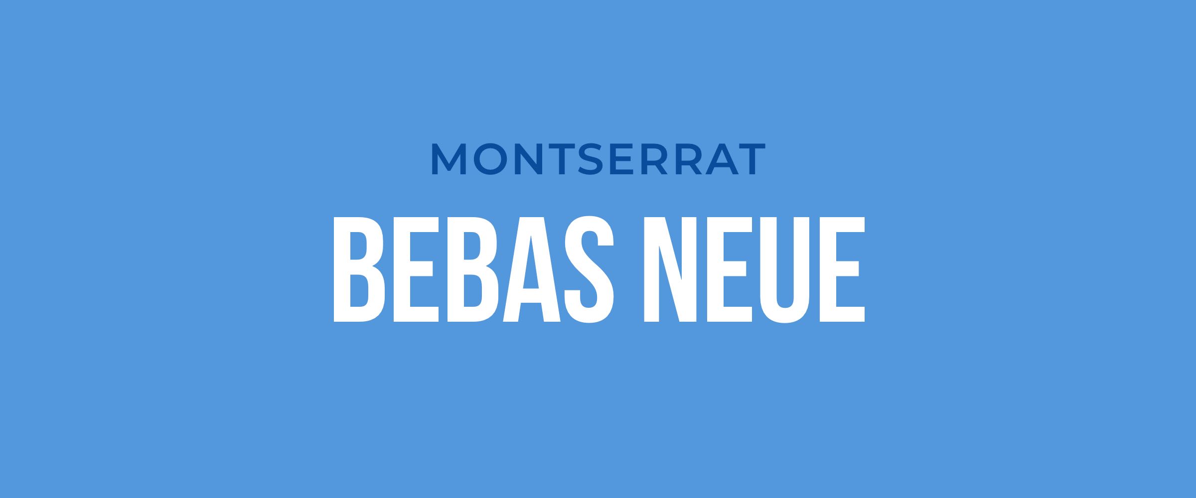
Choose complementary fonts
Good typography creates balance. This can at times feel like a guessing game, but remember that fonts communicate moods and personalities. And often, just like with people, opposites attract. So if you have a font with a strong personality it will pair well with something more neutral and conservative.

Establish visual hierarchy
Once you have a good idea of the fonts that you will be using you need to think about how they are going to be used in size, weight, and spacing(kerning and leading) to guide the user as they navigate the page.
Always be asking yourself, “What should attract the user first?”
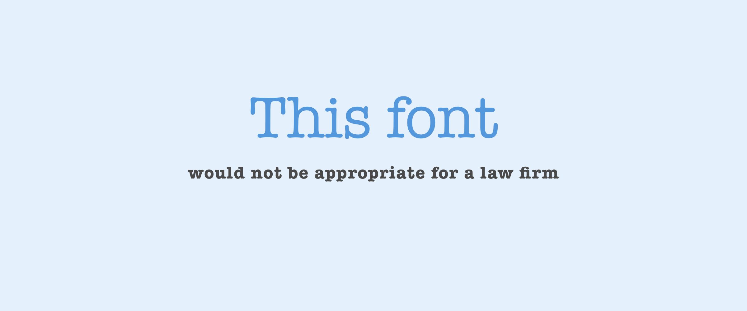
Consider context
Knowing that your design needs to communicate a certain message and that all fonts carry a personality. It’s important to make sure that you're sending the right message. In addition to communicating the right message you should always make sure that the fonts you are using are easily readable at the size they will be displayed in real time.
It’s easy for graphic designers to get caught in viewing their designs in the design program and on large monitors so it’s important to remember how it’s going to be viewed in the real world. If it's print, arrange proofs from the printer. If it's an app, make sure to view it on your phone. If it's a website or web app, make sure you change the dimensions of your view to get an understand how it’ll look on other monitor sizes.
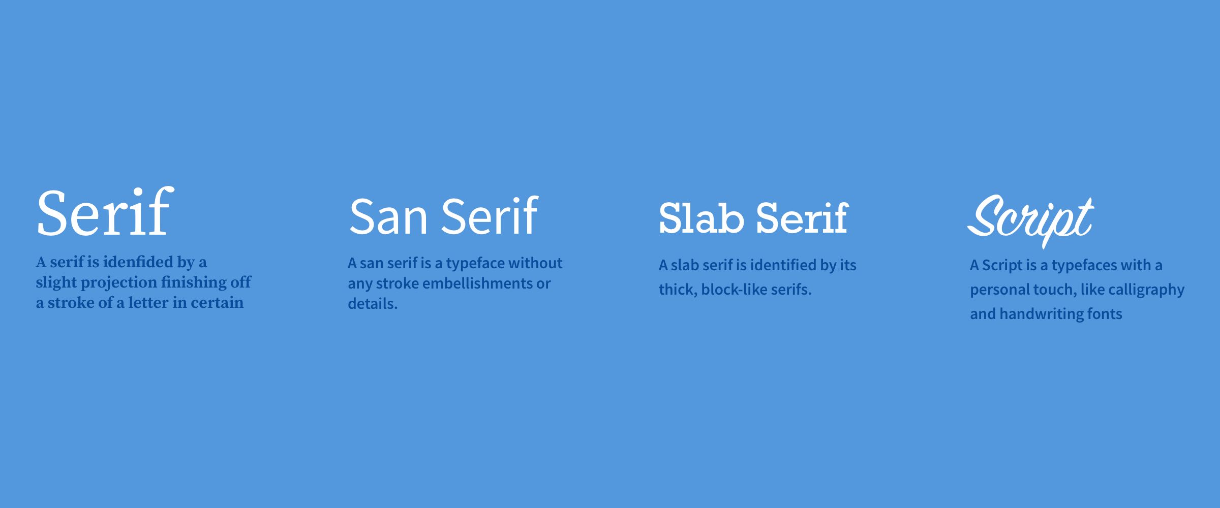
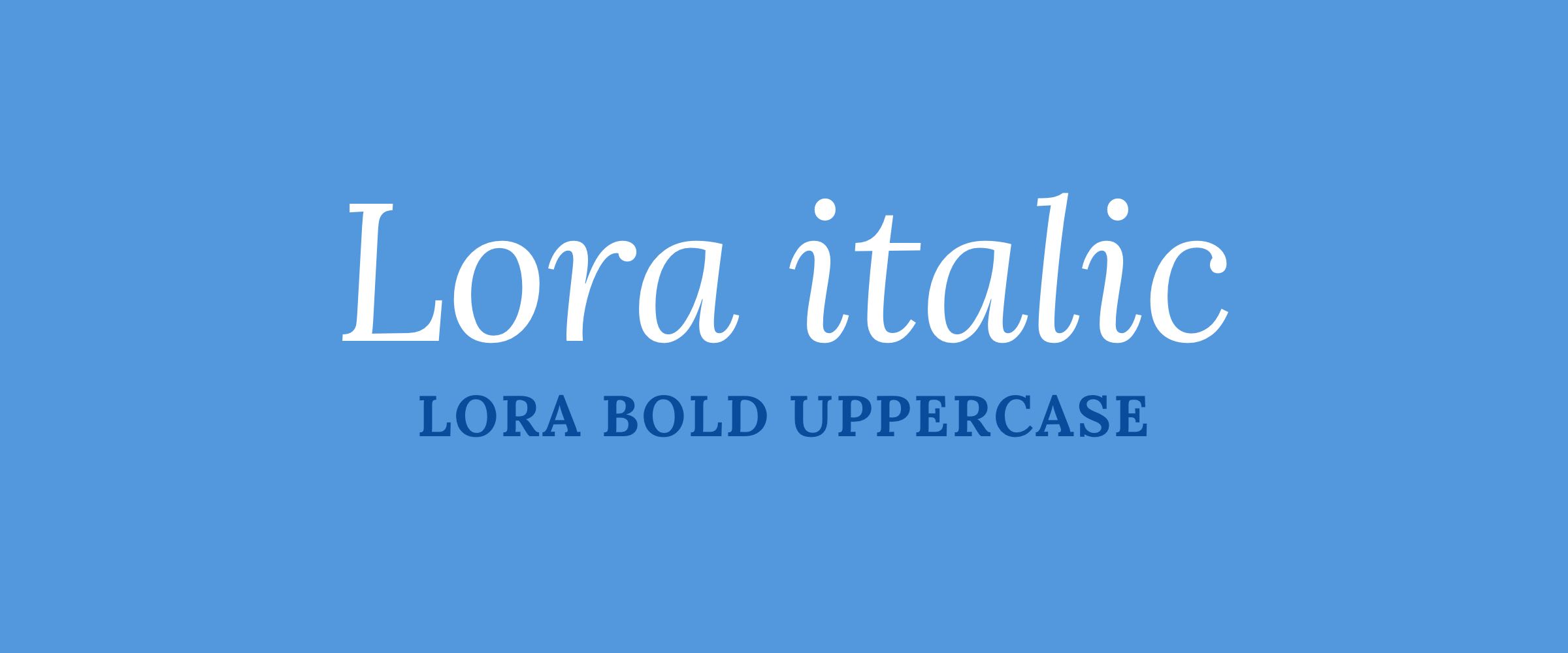
Mix serifs and san serifs
An easy way to create visual interest is by combining a serif font with a san serif font. If used at same size, make sure they have the same x-height. Serifs and san serifs also tend to work well at contrasting sizes.
Create contrast
One of the main reasons that pairing serifs and san serif fonts work well is because they create contrast. Style, size, weight, spacing, color are also other ways to create contrast.
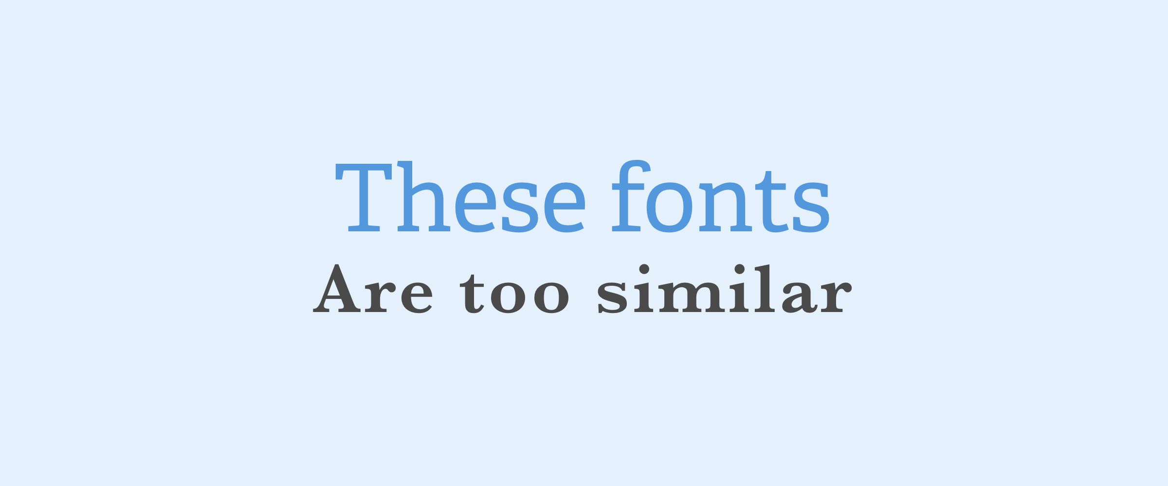
Avoid pairing fonts that are too similar. When you have fonts that are too similar, it’s hard to establish hierarchy.
Use font families
Simply put, the fonts in a font family were created to work together. Use them together.
Limit the number of fonts used
Try to keep your fonts to two or maybe even three different fonts. Limiting your fonts will prevent your user from becoming overwhelmed and allows you to create patterns and a sense of familiarity in your message.
Resources for font pairings:
Rhythm in typography
There are two types of rhythm in typography; Horizontal and Vertical Rhythm.
Horizontal Rhythm
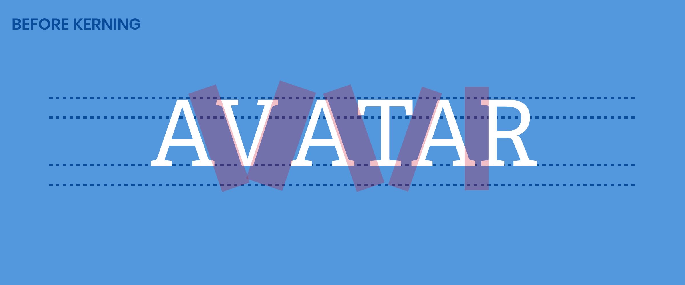
Horizontal Rhythm is the space between the letters. Tracking (or letter spacing) refers to the overall spacing of a word or block of text affecting its overall density and texture. Kerning is a term applied specifically to the spacing adjustment of two particular characters to correct for visually uneven spacing. Kerning adjusts the letters closer together (negative spacing), tracking adjusts the letters further apart (positive spacing).

Here is a sweet game to teach and learn best practices and balance with Kerning: Type.Method
Another factor in Horizontal Rhythm is how the text alignment. Generally for the web, its best to avoid justification of text and stick to flush right, left or centered. Justification often creates irregular spacing between words which breaks the flow and rhythm of reading. These spaces can even form “rivers” in your copy block which is very distracting.
Vertical Rhythm
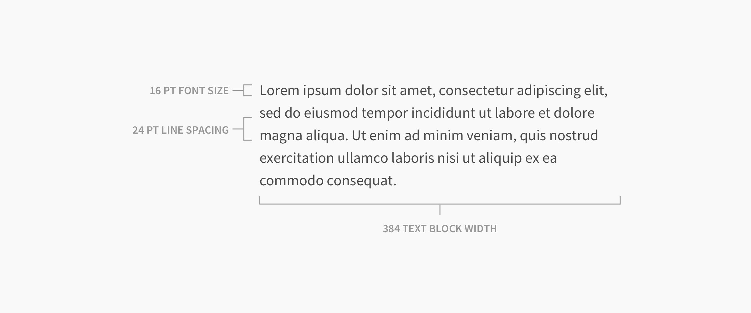
Vertical Rhythm refers to the space between each line of text (Also known as Leading). There is a pretty cool trick to help you mathematically figure out what your vertical rhythm should be.
You can figure out your line height by multiplying your text height by 1.5. So if your main body text of 16 the leading should be set at 24.
Tip: In Sketch, you can multiply right in the input field. 16*1.5 [enter]. It will automatically change your leading to 24.
So what about the width of a text block?
Its suggested that the width of your text block should be 50-60 characters wide. This is the sweet spot and makes it the easiest for your reader to follow along. But let’s be honest, who is going to count the number of characters in each line to assure the optimal line length. There’s actually a pretty easy way to figure this out as well. Multiply your body copy text height with the line height (you find that with the trick discussed above). So using those same numbers 16 x 24 is 384 pixels wide.
Why the vertical and horizontal rhythm matters
The right rhythm not only looks more professional but makes it easier to read and brings a sense of order to your designs. This eliminates distractions allowing you to clearly communicate the right message with your user. This
Modular scaling
How do you go about picking your type sizes? When I first started in web design, it was a rather intimidating experience and honestly it was all pretty trial and error choosing a random font size and rolling with it until you came across an instance where there was a visual conflict and usually resulted in a lack of uniformity throughout the site. This was a nightmare for not only myself but for the developer that had to try and make sense of my size choices.
There is a system that brings method to the madness and is called Modular Scaling.
Additional tips to create hierarchy
Use color and weight to achieve hierarchy. Avoid using font size to differentiate relatable text. If the text is more important make it bolder. If the text is secondary, user a lighter color. Try to limit your color palette. Use dark for primary and gray for secondary. Lighter color for accents.
It's okay to break the rules of typography
As in everything, for every rule in place there are instances where it can be broken. Graphic designers might have an easier time breaking the rules than product designers due to the nature of print vs digital. It's easier to break the rules when the medium goes beyond the screen.
Good typography doesn't always follow the rules.
Use the tips above as general guides and not the end all be all. Keep in mind that in order to effectively break a rule, you need to know it to begin with. The intention here was to lay out the very basics of typography and to provide you with some tips and general guides to strengthen your brand or product.


.png)