

One of the easiest and most common approaches to customizing Material-UI components is using props and classes for one-time use. These one-time-use components often evolve into reusable brand components. However, there's an alternative way you might overlook if you always reach for brand components.
In this article, we'll use global [CSS overrides](https://material-ui.com/customization/globals/#global-css) and [default props](https://material-ui.com/customization/globals/#default-props) in our theme to customize all instances of a Material-UI component in a project.
3 key advantages of this approach
- Our code will be more concise
- It will make our component styling consistent across our application and more portable across projects
- We will avoid breaking the Material-UI components' contracts
Brand Components vs. Theme Overrides and Props
What is a Brand Component?
When developing apps with Material-UI, we often want to customize the appearance and behavior of Material-UI components. In customizing a component, we can make a "brand" component - meaning a Material-UI component with a thin component wrapper, applying classes, and setting props.
const styles = () => ({ ... });

const BrandButton = ({ classes, color, children }) => {
  return (
    <Button classes={classes} variant="contained" color={color}>
      {children}
    </Button>
  );
};

export default withStyles(styles)(BrandButton);
Brand components allow for reusability - but utilizing theme overrides and props has additional advantages:
Less code and fewer files
Component props are set in the theme's props and styles are set in the theme's overrides. This eliminates the need for brand component code and files.
More portable
When using brand components, if we want to use our customized components in another project, we have to move our theme and all our brand component files. When using theme overrides and props, we can simply move our theme.
Leaves the component contract intact
In the example above, the props we intend to accept from the component's user are `color` and `children`. If the component's user is familiar with Material-UI components, they might expect to be able to pass in a `component` prop with the value "a" so the component is an anchor tag that looks like a button because `component` is a valid prop on the Material-UI Button. The BrandButton won't do anything with the `component` prop because it isn't in its props list. This could cause frustration for the user and result in your needing to update the brand component.
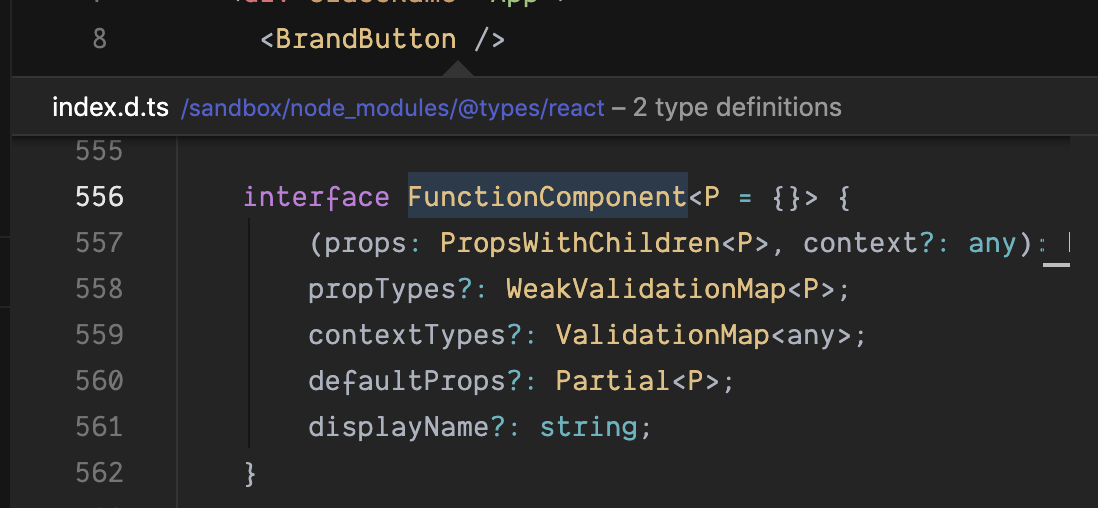
TypeScript consideration
Material-UI has TypeScript support. If you wrap a Material-UI component in a brand component, you lose the component's TypeScript typing!
With the BrandButton, the type is a generic React FunctionComponent type:
When using the component directly and applying styles via theme overrides and props, the component type from Material-UI remains intact:

Create the Theme with a Palette
To begin our example project, we'll create a Material-UI theme and set our primary color to `deepPurple` and our secondary color to `amber`.
import { createMuiTheme } from '@material-ui/core/styles';
import { grey, deepPurple, amber } from '@material-ui/core/colors';

const theme = createMuiTheme({
  palette: {
    primary: {
      main: deepPurple[500],
    },
    secondary: {
      main: amber[500],
      contrastText: deepPurple[900],
    },
  },
});
These colors will be employed whenever a component's color prop is set to `primary` or `secondary`.
→ Learn more about the Material-UI theme palette.
Now that we have a basic theme, we can begin customizing the Material-UI Button, TextField and Tooltip components. We'll start with brand components and then accomplish the same customization using theme overrides and props.
Style Button component
In our first example, we want to tweak the styles of the [Material-UI Button component](https://material-ui.com/api/button/) with variant `contained` and color props `default`, `primary`, and `secondary`.
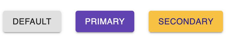
<Button
	variant="contained"
	color="primary" // or color="default" or color="secondary"
>
	Click me!
</Button>
The buttons look like this without any modifications. They employ the colors we defined in our theme's palette, but no other customizations have been made.
We want to customize our buttons to look like this:
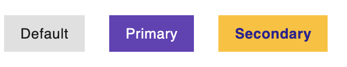
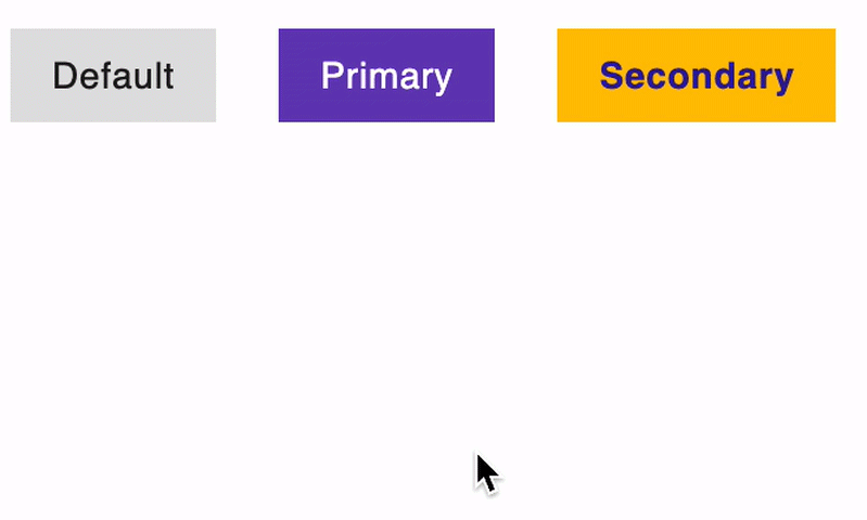
Here are the changes we want to make to the buttons:
- Make the corners square
- Remove the uppercase text transformation
- Remove the drop shadow
- Change the background and text color of our primary button on hover to purple and amber
- Make the text on the secondary button bold
First we'll make these changes using classes and props - then we'll move these customizations to the theme.
Style the buttons using classes
We'll define styles for each of our three button color options (`default`, `primary`, and `secondary`):
import { deepPurple, amber } from '@material-ui/core/colors'

const styles = () => ({
  default: {
    borderRadius: 0, // makes the corners square
    textTransform: 'none', // removes uppercase transformation
  },
  primary: {
    '&:hover': { // changes colors for button hover state
      backgroundColor: amber[500],
      color: deepPurple[900],
    },
  },
  secondary: {
    fontWeight: 700, // make the text bold
  },
});
Using withStyles, the styles we defined become classes that we can access in the Button component's props:
const Buttons = ({ classes }) => { // this `classes` prop is made available by using withStyles below
	// I've left out Grid components below to make this easier to read
  return (
		<div>
			<Button
			  variant="contained"
			  color="default"
			  className={classes.default}
				disableElevation // this prop disables the drop shadow on our button
			>
			  Default
			</Button>

			<Button
			  variant="contained"
			  color="primary"
			  className={clsx(classes.default, classes.primary)} // clsx joins these two classes (.e.g. "default primary")
			  disableElevation // this prop disables the drop shadow on our button
			>
			  Primary
			</Button>

			<Button
			  variant="contained"
			  color="secondary"
			  className={clsx(classes.default, classes.secondary)} // clsx joins these two classes (.e.g. "default secondary")
			  disableElevation // this prop disables the drop shadow on our button
			>
			  Secondary
			</Button>
		</div>
  );
};

export default withStyles(styles)(Buttons);
The complete file looks like this:
import React from 'react';
import { Button, Grid, withStyles } from '@material-ui/core';
import clsx from 'clsx';
import { amber, deepPurple } from '@material-ui/core/colors';

const styles = ({ theme }) => ({
  default: {
    borderRadius: 0,
    textTransform: 'none',
  },
  primary: {
    '&:hover': {
      backgroundColor: amber[500],
      color: deepPurple[900],
    },
  },
  secondary: {
    fontWeight: 700,
  },
});

const Buttons = ({ classes }) => {
  return (
    <Grid container spacing={3}>
      <Grid item>
        <Button
          disableElevation
          variant="contained"
          color="default"
          className={classes.default}
        >
          Default
        </Button>
      </Grid>

      <Grid item>
        <Button
          variant="contained"
          color="primary"
          className={clsx(classes.default, classes.primary)}
          disableElevation
        >
          Primary
        </Button>
      </Grid>

      <Grid item>
        <Button
          variant="contained"
          color="secondary"
          className={clsx(classes.default, classes.secondary)}
          disableElevation
        >
          Secondary
        </Button>
      </Grid>
    </Grid>
  );
};

export default withStyles(styles)(Buttons);
While this works, these modifications won't apply anywhere else in the app where we use the Material-UI Button component. We could make a "brand" component - but remember the drawbacks to that approach outlined earlier.
Customize the buttons using theme props
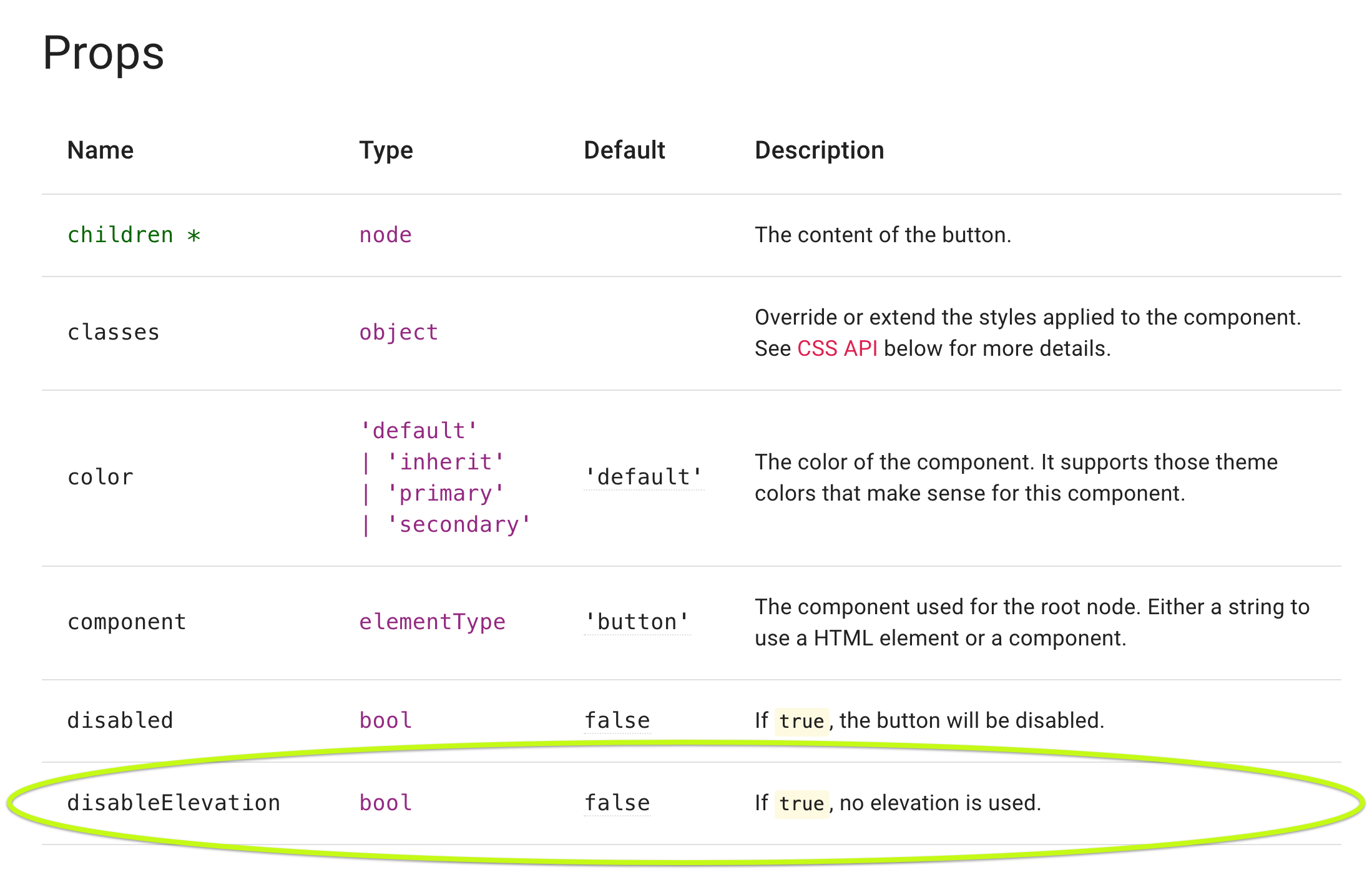
In addition to passing a palette prop into `createMuiTheme`, we can pass in `props` and `overrides`. These properties on our theme allow us to make customizations that apply globally. Instead of setting the `disableElevation` prop on each Button component we use, we can set it in the theme's `props` and it will be applied globally.
const theme = createMuiTheme({
  palette: {
    primary: {
      main: deepPurple[500],
    },
    secondary: {
      main: amber[500],
      contrastText: deepPurple[900],
    },
  },
});

theme.props = {
  MuiButton: { // `MuiButton` is the global class name for the <Button /> component
    disableElevation: true, // this prop disables the drop shadow on all Buttons
  },
};
We know `disableElevation` is a Button prop by looking at the API documentation for the Button component. We also know the default value for the prop is false. In our overrides, we'll set the value to true.
Style the buttons using theme overrides
We can move the styles we defined into the theme using `overrides`.
theme.overrides = {
MuiButton: {
root: {
borderRadius: 0, // square corners
textTransform: 'none', // removes uppercase transformation
},
containedPrimary: {
'&:hover': { // changes colors for hover state
backgroundColor: theme.palette.secondary.main,
color: theme.palette.primary.dark,
},
},
containedSecondary: {
fontWeight: 700, // makes text bold
},
},
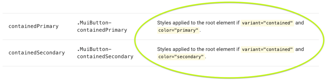
};We want all of our buttons to have square corners and no uppercase text transformation. Looking at the [CSS section of the Button API documentation](https://material-ui.com/api/button/#css), we see we need to target the `MuiButton` global class and `root` within it.

We also know we have styles we only want to apply when the variant is `contained` and the color is `primary` or `secondary` so we look for those global classes in the documentation as well. We need to target `MuiButton` and `containedPrimary` and `containedSecondary`.
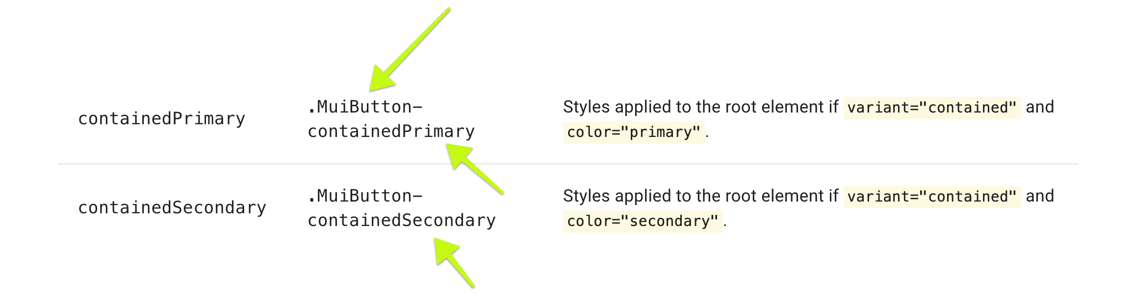
The description helpfully points out what combination of prop values results in the global class being employed:
Now we can use the Button component anywhere in our app and these styles will be applied. We can remove classes and the `disableElevation` prop from the buttons in the `Buttons.js` file:
const Buttons = () => {
	// Grid components removed to make this easier to read
  return (
    <>
      <Button variant="contained" color="default">
        Default
      </Button>

      <Button variant="contained" color="primary">
        Primary
      </Button>

      <Button variant="contained" color="secondary">
        Secondary
      </Button>
		</>
  );
};
What we've gained by moving from classes to theme overrides and props
- We've made the Buttons.js file more concise and therefore easier to read.
- We're assured that we have our styles wherever we use a Button component with `variant="contained"` and `color` "default", "primary" or "secondary".
- We can use our theme across projects, knowing these Button styles are included - without having to move over any component files.
Let's walk through another example by customizing a labeled input.
Style TextField component
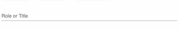
In our next example, we want to tweak the styles of the Material-UI TextField component.
<TextField label="Role or Title" placeholder="Developer" fullWidth />The TextField looks like this without any modifications. It employs the colors we defined in our theme's palette, but no other customizations have been made:
We want to customize our TextField to look like this:
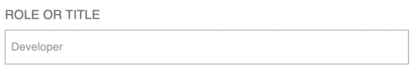
Here are the changes we want to make to the TextField:
- Remove the label shrinking on focus
- Make the label text uppercase and increase the font size
- Increase the space between the label and the input box
- Add a border around the input that turns purple, and is thicker on focus
Style the TextField using classes
First, we'll define styles for our label and input by using the $ruleName syntax to target the input's focused state.
import { grey, deepPurple } from "@material-ui/core/colors";

const styles = ({ spacing, palette: { primary } }) => ({
  label: {
    textTransform: "uppercase",
    fontSize: "1.5rem"
  },
  input: {
    top: spacing(2),
    border: `1px solid ${grey[500]}`,
    outline: `1px solid transparent`, // we use a transparent outline here so the component doesn't move when focused
    padding: spacing(1),
    "&$focused": {
      border: `1px solid ${deepPurple[500]}`,
      outline: `1px solid ${deepPurple[500]}` // this outline makes our "border" thicker without moving the component
    }
  },
  focused: {} // we have to pass in this focused class to make the focused state rule above work
});
Using withStyles, the styles we defined become classes that we can access in the TextField component's props. We disable the label "shrinking" to keep it in the top left corner by adding `shrink: true` to `InputLabelProps` object. We can also disable the input box underline by adding `disableUnderline: true` to the `InputProps` object.
const TextFields = ({ classes }) => {
  return (
    <div>
      <TextField
        label="Role or Title"
        placeholder="Developer"
        fullWidth
        InputLabelProps={{
          shrink: true, // keep the label in the top left corner and don't shrink on input focus
          classes: {
            root: classes.label
          }
        }}
        InputProps={{
          classes: {
            root: classes.input,
            focused: classes.focused // we can't forget to pass this in or &$focused in our input class won't work
          },
          disableUnderline: true // remove the underline
        }}
      />
    </div>
  );
};

export default withStyles(styles)(TextFields);
This is a workable approach, but has the "brand component" drawbacks we outlined above. Let's use theme overrides and props to achieve the same end.
Customize TextField using theme props
Instead of using the `InputLabelProps` and `InputProps` on the TextField to disable the label shrink and input underline, we can set these props in our theme override. Now anywhere we use TextField, the label will be shrunk into place and the underline will be disabled without our having to set these in the component.
theme.props = {
  MuiButton: {
    disableElevation: true,
  },
  MuiInputLabel: {
    shrink: true, <---------
  },
  MuiInput: {
    disableUnderline: true,  <---------
  }
};
When we set the `disableElevation` prop on the Button component, we referenced the Button API documentation. TextField is a component composed of multiple Material-UI components including InputLabel and Input. In targeting these components, we'll reference the InputLabel and Input API documentation.
We know `shrink` is an InputLabel prop by looking at the API documentation for the InputLabel component. We also know the default value for the prop is false. So in our overrides, we'll set the value to true. Likewise, we can reference the Input API documentation to see `disableUnderline` is a prop on Input and the default value is false - so we'll also set it to true.
Next we'll move the styles to the theme overrides.
Style the TextField using theme overrides
theme.overrides = {
	/* Button overrides not included to make this easier to read */
  MuiInputLabel: {
    root: {
      textTransform: 'uppercase',
      fontSize: '1.5rem',
    },
  },
  MuiInput: {
    root: {
      top: theme.spacing(2),
      border: `1px solid ${grey[500]}`,
      outline: `1px solid transparent`,
      padding: theme.spacing(1),
      '&$focused': {
        border: `1px solid ${theme.palette.primary.main}`,
        outline: `1px solid ${theme.palette.primary.main}`,
      },
    },
		// we don't need `focused: {}` with overrides
  },
}
By looking at the [API documentation for the InputLabel](https://material-ui.com/api/input-label/), we know the label styles should be nested in `root` which is nested in `MuiInputLabel`.
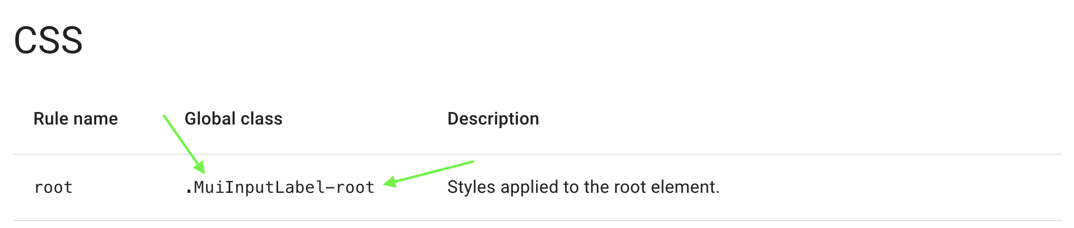
Likewise, the input styles should be nested in the `root` (which is nested in `MuiInput`). When we target the focused state in overrides, we don't have to set `focused` in `MuiInput` like we have to when using classes.

Now we can use the TextField component anywhere in our app and these styles will be applied. We can remove classes and the `InputProps` and `InputLabelProps` prop from the TextField in the `TextFields.js` file:
const TextFields = () => {
  return (
    <div>
      <TextField label="Role or Title" placeholder="Developer" fullWidth />
    </div>
  );
};
What we've gained by moving from classes to theme overrides and props:
- We've made the `TextFields.js` file more concise and therefore easier to read.
- We're assured that we have our styles wherever we use a TextField component.
- We can use our theme across projects, knowing these TextField styles are included - without having to move over any component files.
Style Tooltip component
In our final example, we want to tweak the styles of the Material-UI Tooltip component.
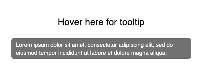
<Tooltip title="Lorem ipsum dolor...">
  Hover here for tooltip
</Tooltip>
The Tooltip looks like this without any modifications:
We want to customize our Tooltip to look like this:
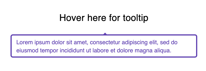
Here are the changes we want to make to the Tooltip:
- Add an arrow
- Change the background and text colors
- Add a border
Style the Tooltip using classes
First, we'll define styles for our tooltip and arrow.
const styles = ({ palette: { primary } }) => ({
  tooltip: {
    backgroundColor: "#fff",
    border: `2px solid ${primary.main}`,
    color: primary.main
  },
  arrow: {
    color: primary.main
  }
});
Using withStyles, the styles we defined become classes that we can access in the Tooltip component's props. We'll add an arrow by adding `arrow` as a Tooltip prop.
const Tooltips = ({ classes }) => {
  const loremIpsum =
    "Lorem ipsum dolor sit amet, consectetur adipiscing elit, sed do eiusmod tempor incididunt ut labore et dolore magna aliqua.";
  return (
    <Tooltip
      arrow
      title={loremIpsum}
      classes={{ tooltip: classes.tooltip, arrow: classes.arrow }}
    >
      <Typography variant="subtitle1" align="center">
        Hover here for tooltip
      </Typography>
    </Tooltip>
  );
};

export default withStyles(styles)(Tooltips);
We can instead refactor, using theme overrides and props to make our code more concise and ensure consistency across the application.
Customize Tooltip using theme props
Instead of using the `arrow` prop on the Tooltip to add an arrow, we can set this prop in our theme props. Now anywhere we use Tooltip, the arrow will be visible without our having to set the prop in the component.
theme.props = {
  MuiButton: {
    disableElevation: true,
  },
  MuiInputLabel: {
    shrink: true,
  },
  MuiInput: {
    disableUnderline: true,
  },
  MuiTooltip: {
    arrow: true, <-----------
  },
};
Style Tooltip using theme overrides
Next, we'll add our styles to the theme overrides. Based on the [Tooltip API documentation](https://material-ui.com/api/tooltip/), we know the classes to target are `tooltip` and `arrow`.
theme.overrides = {

		MuiTooltip: {
	    tooltip: {
	      backgroundColor: '#fff',
	      border: `2px solid ${theme.palette.primary.main}`,
	      color: theme.palette.primary.main,
	    },
	    arrow: {
	      color: theme.palette.primary.main,
	    },
	  },
}
Now we can use the Tooltip component anywhere in our app and these styles will be applied. We can remove classes and the `arrow` prop from the Tooltip in the `Tooltips.js` file:
const Tooltips = () => {
  const loremIpsum =
    'Lorem ipsum dolor sit amet, consectetur adipiscing elit, sed do eiusmod tempor incididunt ut labore et dolore magna aliqua.';
  return (
    <Tooltip title={loremIpsum}>
      <Typography variant="subtitle1" align="center">
        Hover here for tooltip
      </Typography>
    </Tooltip>
  );
};
We enjoy the same benefits here that we saw in the previous two examples - the code is more concise, our component stays consistent throughout the application, and we can move this styling across projects by simply copying over the theme.
To learn more, check out the resources listed below 👇🏻
Source code
https://github.com/kelseyleftwich/mui-overrides
Learn more about Material-UI customization
Want to join our development team?
We're always looking for talented and open-minded people to help us bring new ideas to life. See what it's like to work at Headway and the opportunities we currently have available.