

Let's talk about improving design system management in Figma. An experienced product designer knows that they are essential to improve production and prevent design debt from growing. A shared library with a collection of elements, documentation, and patterns can go a long way. So, what is the best way to create and maintain a design system in Figma?
Figma is a powerful tool with a well managed design system. As a single source of truth, It increases productivity, developer communication and handoffs, and helps build a consistent interface. When you design and prototype new ideas with real-time collaboration, with all the moving pieces within a product, a good management system is imperative.
For a crash course on managing Figma Design Systems, and dive deeper, you can check out our video below. In the video below, I walk through best practices for design system documentation, version control, managing status, and keeping your team aligned as the design system grows in Figma.
The benefits of better Figma design system management
- One of the most tangible ways to create a systems mindset for your company
- Increase your team's efficiency and consistency
- Improves design hand-offs
- They help communicate choices and status of critical components
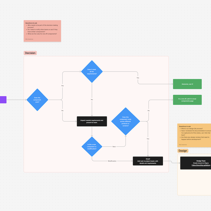
How to organize a design system in Figma
What we've learned so far
It all starts with improving design team communication.
We've started a process for managing our design systems and multi-tiered UI kits here at Headway. We want to share our process so we can not only contribute to the community, but also learn some best practices from the design & development community.
We'll be directly addressing Figma here since that's what we use in-house - but this should be applicable to any design tool and can be easily modified as you focus on getting your design system ready for AI.
The goal - managing status
The Headway design team wanted to create a simple visual language to help manage the status of designs that would be visible inside the design toolset (it would also be shown within Figma's live embed). This goes beyond basic version control. We had a good discussion around the approach and how each project is a little different.
In this article, we'll keep things as abstract as possible. Teams work in different ways at different organizations, but you can apply these methods within your own unique projects.
Design system documentation and elements for communication
Covers
Proper design system documentation can make or break communication within your product team. Figma's default file view is great for seeing all of your design projects as a whole. However, when your project starts to grow and is distributed across many files it can be hard to tell which file is which. Along with a good naming convention, having a cover as the first page in your file with some key details can go along way.
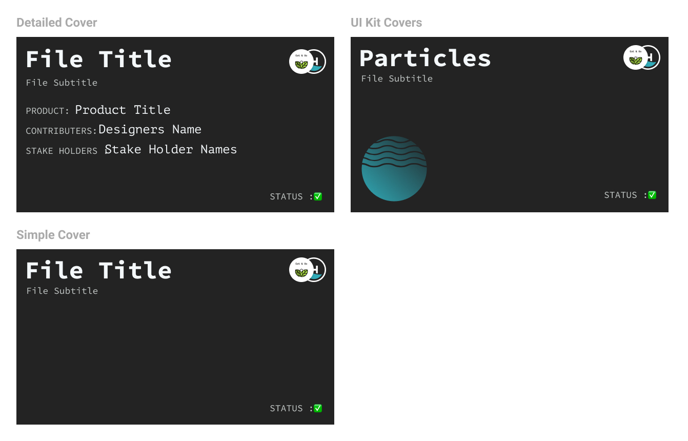
We created three types of covers depending on the detail needed for the file. The goal is to communicate file or project status, stakeholders, file type, and the primary designers on each file for clarity. We've included a few examples in the system that follow how we go about organizing our files.
Below is an example of what the final output of the covers will look like in Figma.
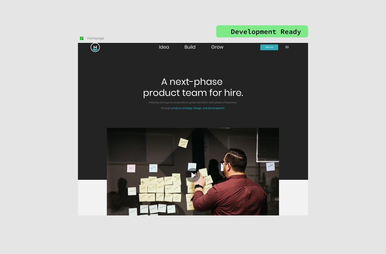
Status and notes
With real-time collaboration, keeping our team on the same page is always in the forefront of our minds - we're a remote first company and work with clients and teams from all over the place. We're big on zoom meetings to sync up but even bigger on being able to communicate asynchronously.
Documenting notes and the current status in our projects helps us communicate thoughts or requirements (such as what should or shouldn't be worked on ) much easier than trying to communicate via a prototype, or a static screen.
We've created an element that we can add to any frame that helps communicate the status of an individual screen and allows us to add a description or notes to each screen. To add this to a frame, you simply drop it in, make sure the height and width are the same as the frame you're placing it in, and ensure Clip content is turned off.
Once you've added your notes and set the status, make sure it's the top layer - and lock it - so it can't be selected. We've included 3 statuses, but this system can easily be expanded if needed.
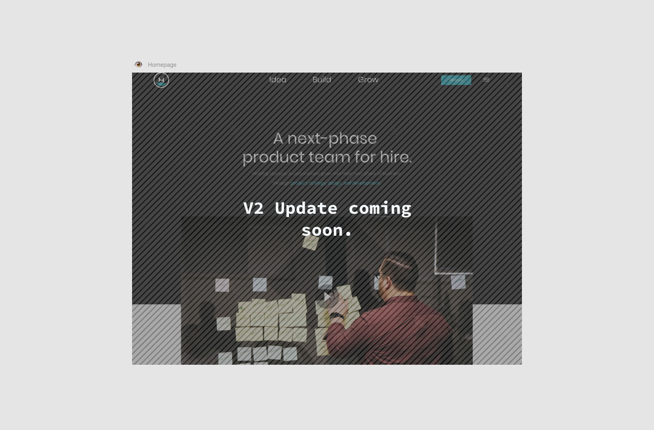
Overlay asset
Sometimes in a design, we need to mark out a space that isn't done yet, or obscure items so the right things are focused on. We've added a generic overlay asset that we can use to communicate larger messages to stakeholders. This overlay asset has been really useful in removing "distractions" when communicating ideas.
Frame description and title
When organizing a design system, we needed a way to have bolder titles and to communicate notes to other designers who might join the team at a later date. For design system management, using an external documentation tool is great, but having something in the Figma file is even better. We created a simple component that has a title and a description area so it can be dropped into a frame and communicate how the items in that frame might be used. In this example below, we have the frame legend on the side of the frame so we can leave detailed notes about how things function in the frame.

PRO-TIP: You have to be using frames to organize your design system to really gain the benefits of this component.
Emojis
We use emojis on our cover cards and in the names of various frames. We feel these can communicate a quick thought at a glance and help make things standout along with the other elements. We've developed a pattern that works for us, but is expandable if needed.
Placing emojis in the file name, layer name, or frame name will help everyone understand the status of the design, component, or prototype. Here is what we've identified to work for us.
✏️ - In Design
We use the pencil to communicate things are in design at the moment. This helps communicate to everyone that this object shouldn't be taken as final by any means.
👁️ - Ready for Review
Once a design is ready for review, we'll add this eye in front of the name to communicate that the current design task is complete and we're waiting for it to be reviewed and approved.
✅ - Approved and Ready for Development
Just like it says, this item has received approval from stakeholders and is ready to be handed off to development.
👻 - Depreciating / Not sure if this is being used
Not used much, but sometimes a component might show up that we're unsure of. We also might be building a new one so we'll put the ghost in the name to communicate that it should be used with caution.
🌀 - In Development
The item is currently in development and has been handed off to the development team.
🅿️ - Deployed / Live
This is live on the site or app.
📁 - Archive File
We're keeping this file around so we can take a look at it.
❌ - Do not use
Do not use this item at any cost. We needed a way to depreciate components or designs - this is the way we communicate that we're in the process of making a new one or removing the said item.
Naming conventions
Naming layers, frames, and groups is difficult enough to keep everything organized. We've started to name our frames a specific way for easier scan-ability and readability. Our general rule is to keep things named what they are (or the state they are in) and use abbreviations and / to create a structure. Here is an example:
Login Screen
— LS / Forgot Password
— LS / FP / Modal Confirmation
— LS / Error - Incorrect Password
— LS / Successful Email Entry
— LS / Successful Password
This format is still being experimented on, but so far it's helped communicate structure and given some order to our design files. Now below, we've shown how we might use emoji's in the names - which would give our final frame collection look something like this:
🌀 Login Screen
✅ — LS / Forgot Password
👁️ — LS / FP / Modal Confirmation
👁️ — LS / Error - Incorrect Password
✏️ — LS / Successful Email Entry
✏️ — LS / Successful Password
Using the emoji's along with the naming convention allows us to communicate status and how items might be linked logically.
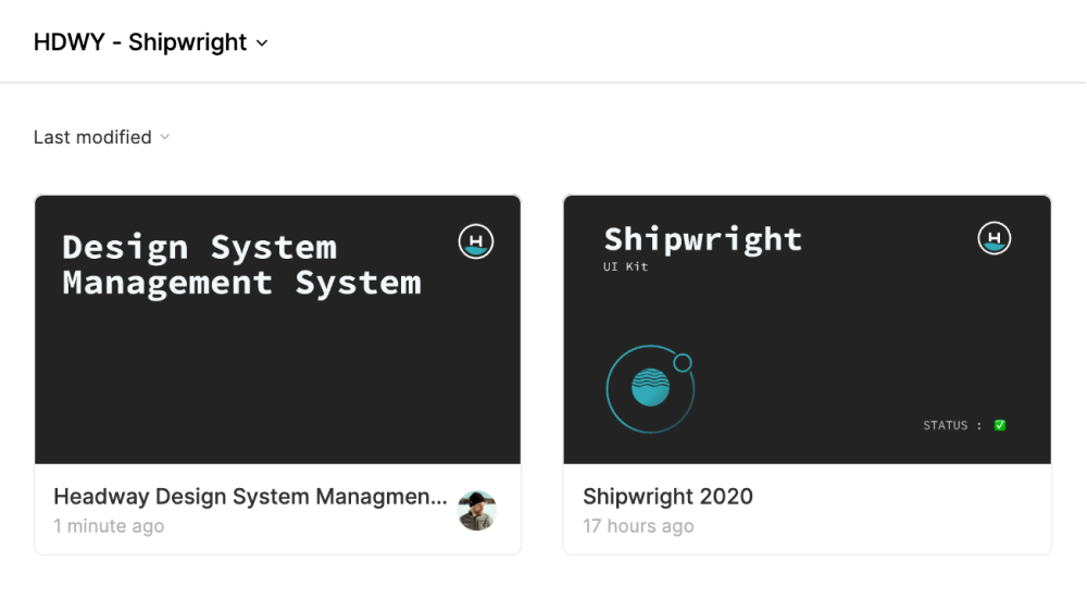
Our free Figma design system UI kit
All of these assets are in our free Figma UI Kit - Shipwright, so please check it out!
We hope that this process continues to evolve, and maybe a plugin will show up to help automate this for everyone. Speaking of plugins, we've been looking at Status Annotation as a plugin to handle status on our frames.
Become a design system pro with our new video course
We just released our premium design system course for Figma.
It covers everything from planning, laying foundations, design tokens, developer handoffs, and more.
Everything you need to help lead your team with a clear design system process.
Free Figma design system resources
Design Systems Course for Product Teams
In this free course, learn how to build design systems that save you time, improve the quality of your product, and empower your team to go further faster.
Get Started with Multi-Tiered UI Kits for Design Systems
Learn how Multi-Tiered UI Kits can support multiple mini products that need to share similar themes & patterns under one brand and still create unique experiences.
Getting started with Design Tokens in Figma
An introduction to creating and managing design tokens in Figma to improve design hand-offs for development teams.
Figma Plugins for Better App Design Workflows
A growing list of our favorite Figma plugins and how they fit into our process at Headway.
Design System Management - Updates and Communication
The step-by-step process we use at Headway to keep our design systems up to date between design and development teams.
The Design System Stakeholder Guide: Translating Progress into Business Value
Struggling to explain your design system’s impact? Discover tools and rituals to align your team’s work with what leadership cares about.
Want to join our design team?
We're always looking for talented and open-minded people to help us bring new ideas to life. See what it's like to work at Headway and the opportunities we currently have available.
Learn more about careers at Headway
